The form is available, but the task is still difficult
An employee opens an internal request form and sees three boxes labelled Type, Name and Info. The instructions do not explain what the request covers. After completing it, the employee selects Submit and receives a red message saying Error. There is no indication of which entry needs correction or whether anything was sent.
The form may be easy for its designer to understand because the designer already knows the process. A person encountering it during a working day has different information. They need to understand its purpose, what each field asks for and how to recover from a mistake. Publishing a link does not establish that the task is usable.
For HR service owners, form review is a practical place to apply AI with a clear boundary. A model can examine supplied wording and code, compare them with selected guidance and draft an issue log. The owner decides what information is necessary and arranges checks of the actual form. The model's review remains evidence to consider.
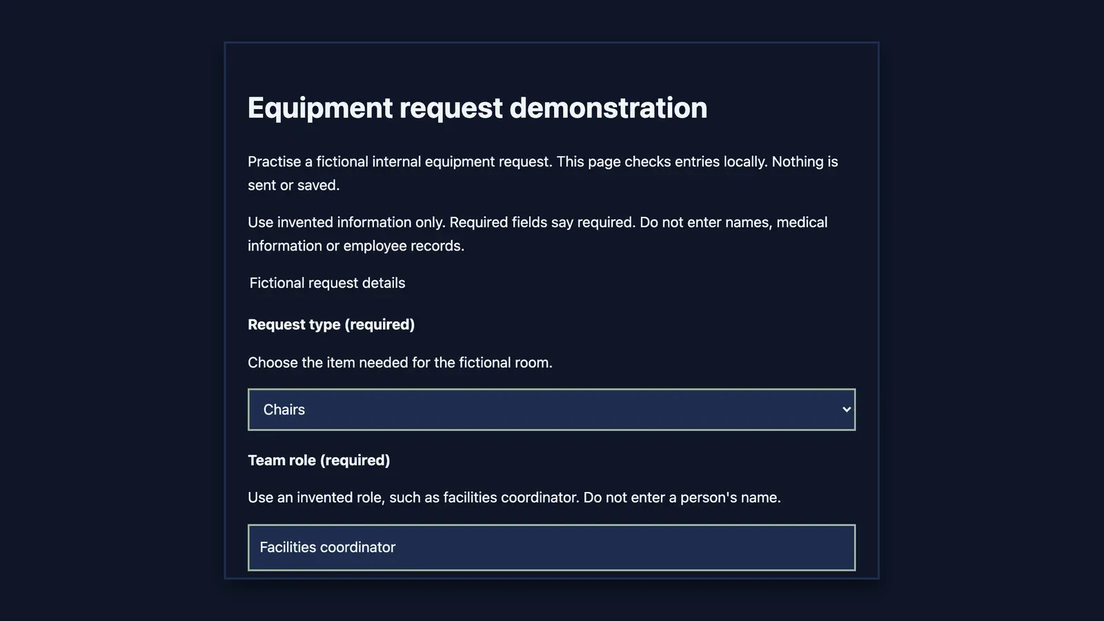
The worked example is a fictional internal equipment request. It has no connection to employee records, a ticketing service or a submission endpoint. Its initial defects are constructed. The corrected version was opened in an isolated local Chrome context for limited interaction checks. Those observations are described separately from the work still needed.
Establish the purpose before rewriting the questions
Write a short purpose statement that explains what the person can achieve. Equipment request demonstration is clearer than Request when the page exists only to practise a workflow. For a real form, the purpose should also explain where the request goes and what happens next, using information confirmed by the service owner.
Check whether each field contributes to that purpose. The fictional form needs an item type, an invented team role and a description of the equipment and quantity. It includes an optional delivery note. A person's name, medical history or employment circumstances are unnecessary for this demonstration and are explicitly excluded.
Do not let AI add fields because they are common in other forms. An employee number or date of birth can look administratively sensible while serving no defined need. Ask the owner to justify collection before adding it. A shorter form with well-chosen fields is easier to review than an expanded one whose purpose has become unclear.
Use the approved information-handling arrangements for any real implementation. This example uses constructed information throughout. It does not establish that all equipment requests are non-sensitive or that a local demonstration provides the controls required for a live HR service. The service context and actual information flow still need review.
Give every control a persistent, meaningful label
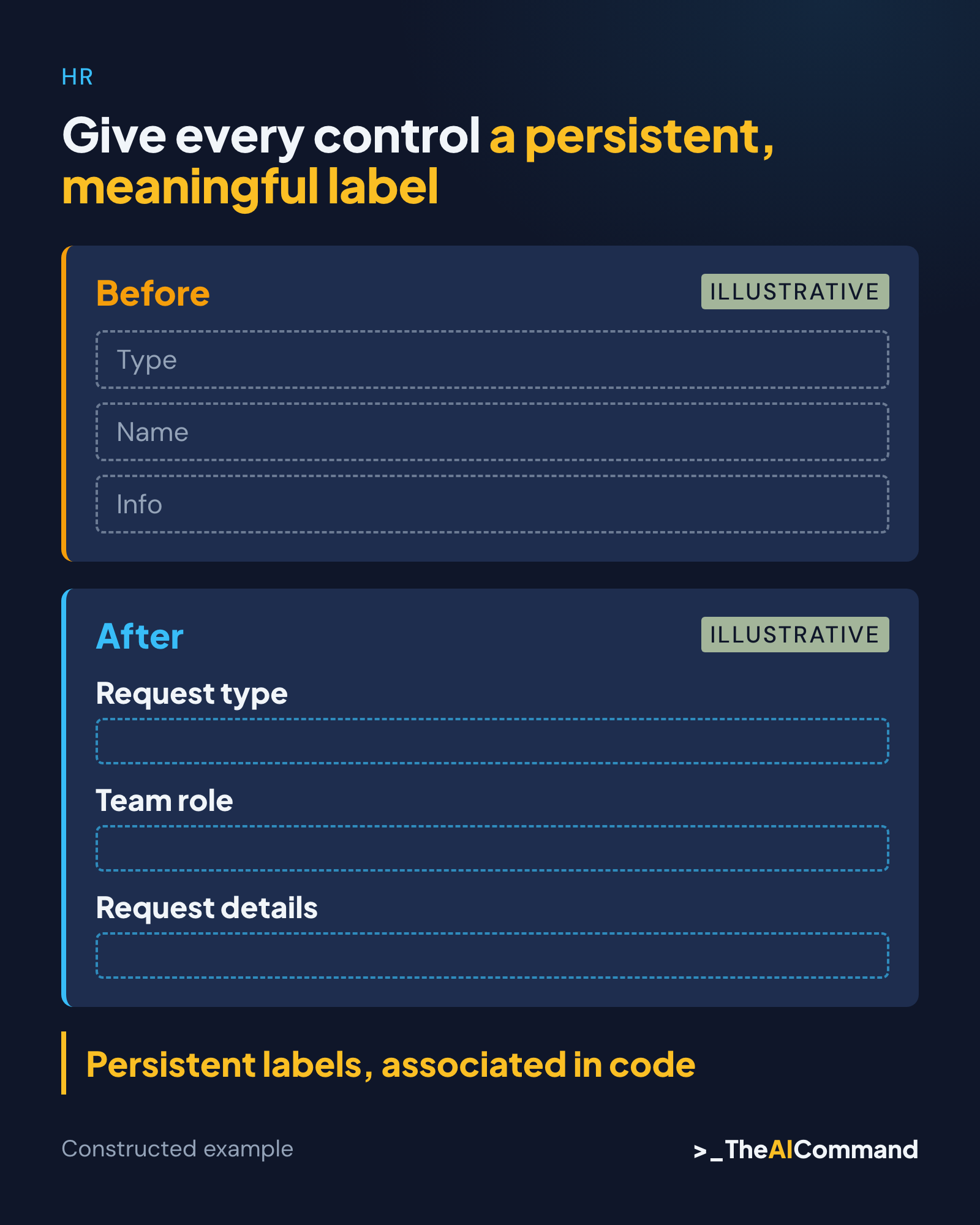
A label should describe what the person is being asked to enter. Team role is more specific than Name in this example, because the exercise asks for an invented role rather than an individual's identity. Request details explains the field's purpose more clearly than Info, while nearby instructions explain the expected content.
W3C's forms guidance describes providing labels for controls and associating them explicitly in code. For an explicit HTML label, its for attribute matches the control's id. Nearby text that looks like a label does not establish that relationship. The implemented form must expose the association to the browser and assistive technology. Source: W3C labels
Do not rely on placeholder text as the only instruction. It can disappear during entry and does not replace a persistent label. In the corrected example, each control has a visible label that remains present, with separate explanatory text where needed. Required and optional status are stated in words. Source: W3C instructions
Ask the model to identify the evidence for its label assessment. A useful issue log names the control, its visible text and the relevant code association. It can say that the source appears to lack a persistent label. It cannot claim that a screen reader announced the control correctly unless someone actually tested that behaviour.
Make instructions useful while the person is entering information
Place a short explanation near the field that needs it. The team-role instruction says to use an invented role and avoid a person's name. The details instruction asks for the equipment and quantity. The optional delivery note asks for fictional placement information. Each instruction supports a specific decision the person has to make.
Keep examples clearly illustrative. Facilities coordinator helps explain the expected kind of entry; it is not a default value to submit accidentally. The form should not prepopulate plausible personal information merely to look complete. A reviewer needs to distinguish guidance from data that will be processed.
Associate explanatory text with the control in code when it is needed to understand the field. The demonstration uses description references so the browser's accessibility tree can expose help text alongside the control. That inspection is useful evidence, but it does not establish how every browser and screen-reader combination will present it.
Review the instructions as a whole. A page that warns against real employee information in one place and asks for a person's full name in another creates a conflict. AI can help find such inconsistencies, but the service owner needs to decide the intended collection and ensure the field design follows it.
Replace a generic error with a recovery route
The initial demonstration displays Error and changes borders to red after submission. It does not identify which field needs attention or what correction would help. The problem is broader than colour choice. The person needs a specific explanation and a way to reach the affected control without guessing.
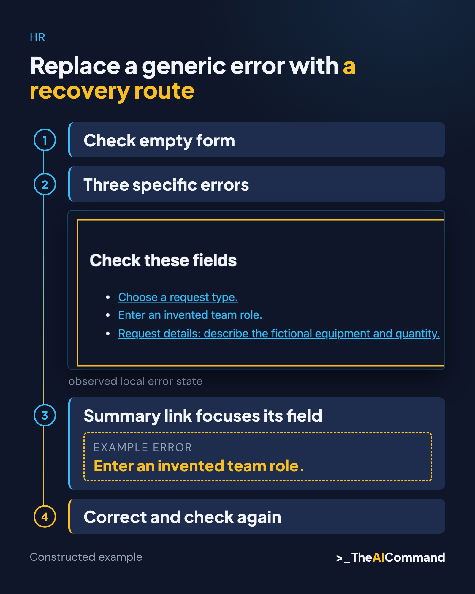
The corrected version checks three required fields. If any are empty, it creates a summary with links to those controls and shows a message beside each one. An empty request type produces Choose a request type. An empty team role produces Enter an invented team role. The details message asks for the fictional equipment and quantity.
W3C's notification guidance addresses useful feedback, including errors and correction. The demonstration applies those principles through a linked summary and associated field messages. It is one implementation choice, not a universal error pattern that can be copied without testing the surrounding interface. Source: W3C notifications
Error handling must preserve the person's work. A partial failure should not clear valid fields and force the person to start again. It also should not claim a request was sent when the demonstration only checked local entries. A meaningful outcome message describes the action that actually occurred.
Walk through the constructed review
The initial source has three controls using only placeholder wording and a generic Submit button. The review log records vague purpose, missing persistent labels, unclear required fields and an unhelpful error pattern. These observations come from inspecting the constructed source, rather than a complaint about an existing organisational form.
The revised source contains four labelled controls. Request type offers Chairs and Table. Request type, Team role and Request details are required. Delivery note is optional. The button says Check demo request, and the purpose statement explains that nothing is sent or saved. This gives the user an accurate account of the demonstration's boundary.
The local check used Chrome identified by its browser-reported version 156. An accessibility snapshot of the final version exposed the controls with their labels and descriptions. Tab key presses reached request type, team role, request details, delivery note and the check button in that order. The focused button had a solid computed outline.
Submitting the empty form moved focus to the error-summary region. The result contained three links, one for each required field, and marked those controls invalid. Each summary link, activated with the Enter key, moved focus to its field. These are observed interactions in the local demonstration, not predictions from the source code.
After entering Chairs, Facilities coordinator and a fictional two-chair request, the summary was hidden and invalid states were cleared. The optional delivery note remained blank. The result stated that the demo check was complete and nothing had been sent or saved. The source contains no submission or storage integration.
At a 320-pixel viewport, the measured page width did not exceed the viewport and the controls stacked in a single column. This is a narrow layout check. It does not establish performance at every zoom level, with all text settings or across all devices. Those limits still apply.
Record issues in a way the implementer can act on
Give each issue a stable identifier, affected field, observed condition and suggested change. Include the relevant source guidance and the test needed after implementation. A statement such as improve accessibility is too broad to close. An issue about a missing label can name the control and specify how the association will be checked.
Distinguish wording issues from implementation issues. Clearer text can still be attached to the wrong control. Correct HTML can still ask an unnecessary or confusing question. HR service ownership and technical review need to meet at the actual task, rather than assuming one kind of improvement resolves the other.
Record severity in relation to the user's ability to complete the task. A generic error that prevents recovery may deserve attention before a minor stylistic inconsistency. The model can propose priorities with reasons, but the owner confirms the impact and remediation order using the actual service context.
Close an issue only against the revised version and observed check. If the form changes later, retain the earlier finding and the version that addressed it. A screenshot of an improved appearance is not enough to prove that keyboard behaviour or field associations were corrected. Keep the relevant evidence with the issue.
Test beyond the AI review and one browser
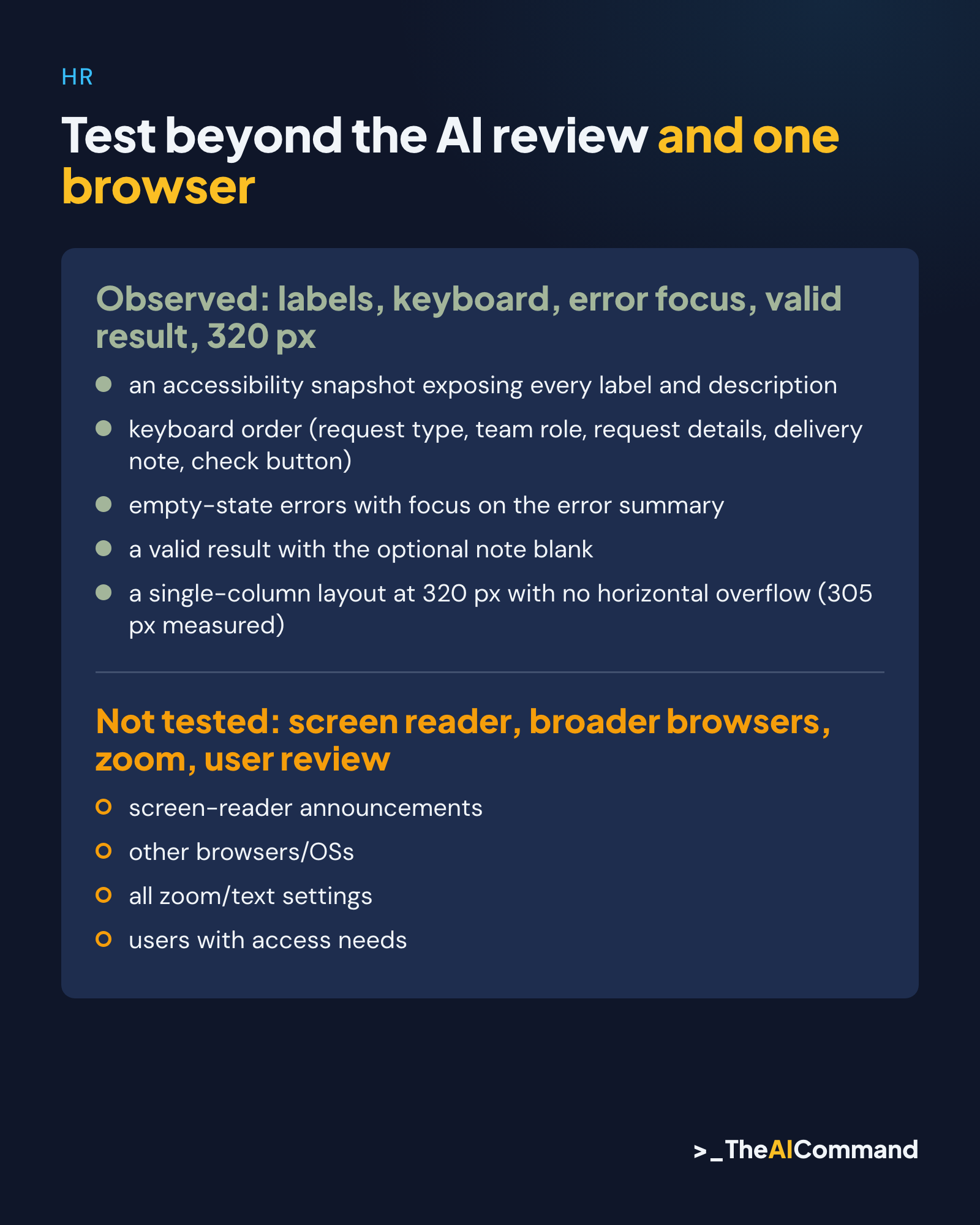
The next review needs actual screen-reader testing, keyboard checks across relevant environments and feedback from people with access needs. Include error recovery and successful completion, not only the initial blank page. A control that sounds clear in isolation can become confusing when instructions and errors are announced together.
Test zoom, text resizing and narrow layouts using the intended delivery environment. Check whether focus remains visible and content can be reached without losing context. The local demonstration's small viewport result is a useful observation to retain, but it cannot substitute for those separate checks.
The Australian Human Rights Commission's digital-access guidelines support attention to equal access and relevant standards. The guidelines explicitly state that they are not legally binding. Neither this tutorial nor its checklist establishes legal compliance or replaces consideration of the applicable obligations. Source: AHRC
Plan for support when someone cannot complete the form. The appropriate alternative depends on the service and the person. Do not assume that a generic contact email resolves every barrier. Confirm how assistance works, who receives the request and how privacy is preserved through that route.
Review the service, then maintain the form
A form is one part of an HR service. The person also needs to understand what happens after completion and how to correct or follow up a request. For a live implementation, review those steps with the same attention to language and access. A clear entry screen cannot compensate for an inaccessible outcome message.
Retest when fields, validation rules or delivery platforms change. Keep the issue log, source version and observed results together. AI can help compare revisions and prepare review notes, but a new draft does not inherit the previous version's testing. The changed interaction needs its own check.
Begin with one form people actually need to complete. Clarify its purpose, justify its fields and inspect the implemented labels and recovery path. Use AI to make the review more explicit, then involve the people and tests needed to establish whether the service works for its users.
Reusable materials
Form review and demonstration pack
Fictional internal equipment request. No actual employee information or live service. Corrected code was checked locally in an isolated Chrome context. Screen-reader, broader browser, zoom and user testing remain pending.
Review issue log
Review prompt
Manual checks for the implemented form
- Read the purpose and exclusions before entering invented data.
- Tab through all controls and verify a visible focus indicator.
- Check persistent labels and descriptions in the implementation and accessibility tree.
- Submit empty fields. Verify specific errors, summary focus and working error links.
- Keep a valid entry while another field fails; verify it survives.
- Correct the required fields with an optional note blank. Confirm errors clear and the result accurately says nothing was sent or saved.
- Check narrow layout, zoom/text settings, relevant assistive technology and actual user tasks.
Initial source, deliberately defective
This is constructed teaching code. Do not use it as a production form.
Corrected local demonstration
Save this code as a local HTML file to repeat the checks. It has no transmission or storage integration. Errors remain until the next check; changing a field clears any earlier success message. The controls start disabled and are enabled only after the local handlers are installed. A form-action policy also blocks native submission. When scripts are unavailable, a notice is displayed and the controls remain disabled.
Observed evidence and limits
Chrome reported version 156; the browser-reported OS string is not independent OS verification. Observed on the final version, using real key presses: an accessibility snapshot exposing every label and description, keyboard order (request type, team role, request details, delivery note, check button), empty-state errors with focus on the error summary, each summary link moving focus to its field, a valid result with the optional note blank, a whitespace role error with other entries kept, a single-column layout at 320 px with no horizontal overflow (305 px measured), and all five controls disabled with scripts disallowed.
Not tested: screen-reader announcements, other browsers/OSs, all zoom/text settings, users with access needs, real submission, server validation, real data handling or legal compliance.
Review correction and repeat checks
A final review found that the earlier local demonstration relied entirely on JavaScript to prevent native submission. The corrected source now starts with a disabled fieldset and enables it only after handlers are installed, with a form-action restriction as another boundary. Repeated keyboard, empty, valid and whitespace/partial checks passed in the final source. In a sandboxed frame with scripts disallowed, all five controls including the button remained disabled. This is a scoped no-script check, not a complete browser failure-mode test.
Related reading
References
- W3C Web Accessibility Initiative, Labeling Controls (Forms Tutorial), updated 13 May 2024: https://www.w3.org/WAI/tutorials/forms/labels/
- W3C Web Accessibility Initiative, Form Instructions (Forms Tutorial), updated 13 May 2024: https://www.w3.org/WAI/tutorials/forms/instructions/
- W3C Web Accessibility Initiative, User Notifications (Forms Tutorial), updated 3 June 2022: https://www.w3.org/WAI/tutorials/forms/notifications/
- Australian Human Rights Commission, Guidelines on equal access to digital goods and services, April 2025: https://humanrights.gov.au/resource-hub/by-resource-type/guidelines-and-standards/guides-and-standards-disability-rights/guidelines-equal-access-digital-goods-and-services
TheAICommand. Intelligence, At Your Command.