Start with what the person needs to do
A request to build a simple internal form can produce a page within minutes. It can also produce unexplained fields, a misleading Submit button and errors that nobody can correct. The difficult work begins before the HTML: deciding what information is necessary and what the interface must communicate at each step.
Use a plain-language brief that describes the user task, inputs and outcome. For this tutorial, the task is to practise an internal equipment request using invented information. The page checks whether the required entries are present. It does not send a request, create a ticket or store the entered data.
That small boundary makes the example useful for learning. The reader can inspect the code and repeat the interactions without connecting a workplace service. It also prevents a successful local demonstration from being confused with a finished application. A live form would introduce processing, security and operational requirements beyond this exercise.
The example was constructed directly for the article and checked in an isolated local Chrome context. No separate AI-service run is claimed. The reusable prompt describes how to request the same bounded build from a coding assistant. The observed results come from the supplied implementation, rather than an invented account of what a product generated.
Translate the brief into a field specification
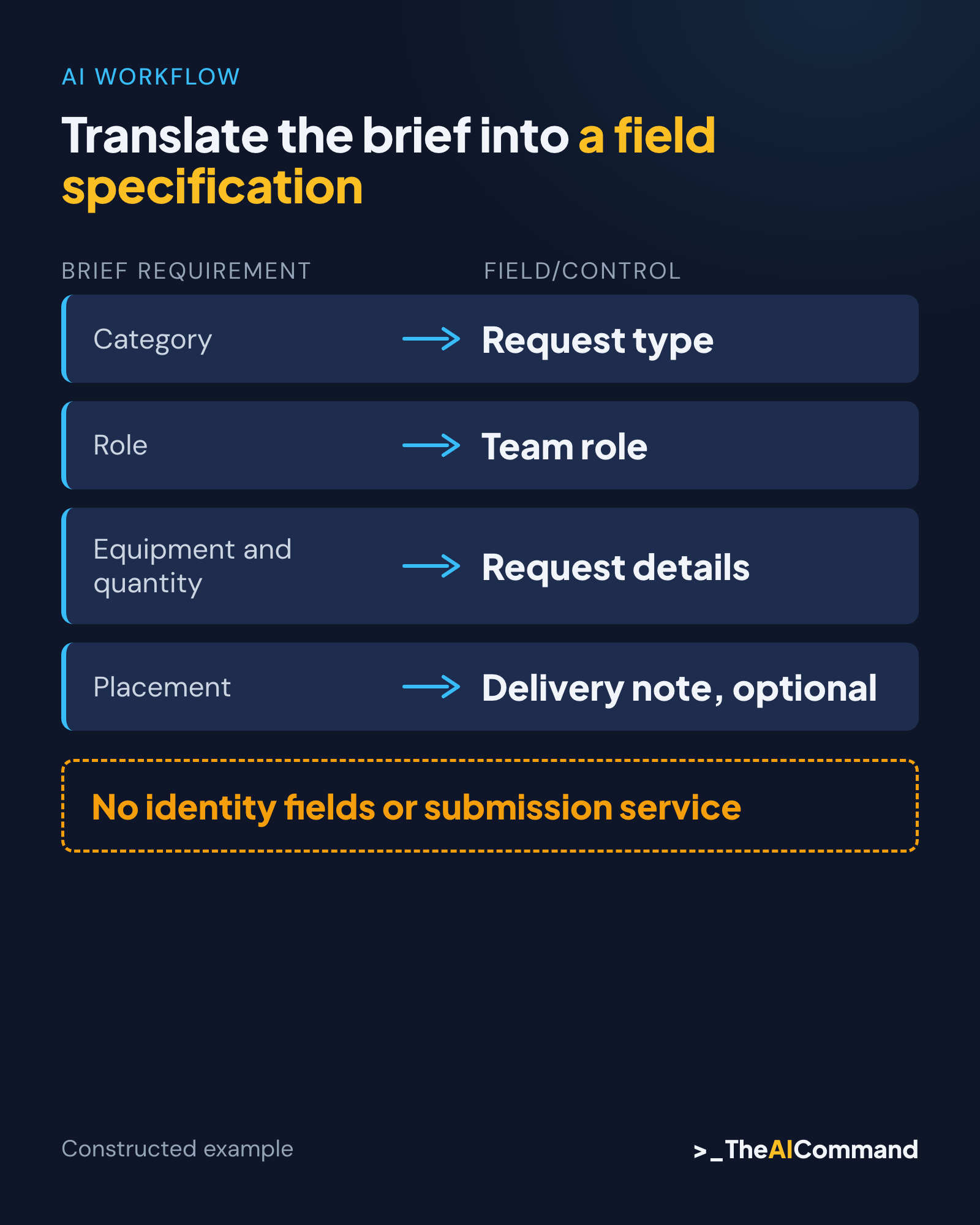
The form needs to identify the equipment category, an invented requesting role and the equipment details. It also allows optional placement instructions. Write those requirements as four fields with their purpose, control type and required status. This gives the model a specification it can follow and the reviewer something concrete to compare with the code.
Request type uses a short select list because the demonstration allows Chairs or Table. Team role uses a text input and explicitly asks for a fictional role rather than a person's name. Request details uses a text area for equipment and quantity. Delivery note uses another text area and is marked optional.
Do not add fields merely because a generated template usually includes them. A login, employee number, attachment upload or medical explanation serves no purpose in this brief. Each addition would expand the information and behaviour needing review. The simplest appropriate form is the one that collects only what this task actually needs.
Define the outcome in the same specification. Empty required fields produce correction messages. Valid required fields produce a local demonstration result. The optional note can remain blank. No entered value authorises an employment decision, purchase or external communication. The button label and result text must reflect that boundary.
Ask for ordinary HTML with visible relationships
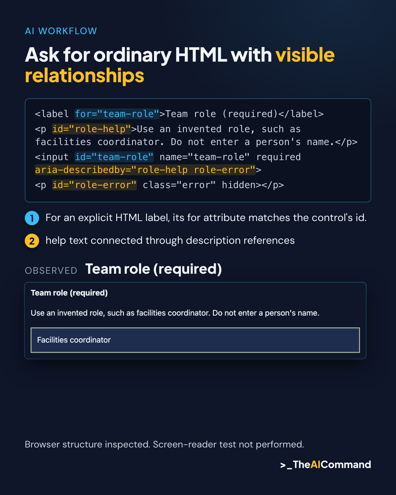
For a small demonstration, native HTML controls make the structure easier to inspect. A label associated with its control, help text connected through description references and a standard button provide a clear starting point. Avoid a custom widget when the task can be completed with a familiar select or text field.
W3C's label guidance explains the explicit relationship between a label's for attribute and a control's id. The generated code should make that match easy to see. Ask for unique identifiers and check them. Correct visible text is only part of the requirement; the association needs to exist in the implementation. Source: W3C labels
Provide persistent instructions for required entries and examples. W3C's instructions tutorial discusses required and optional information, relevant formats and the limits of placeholder text. In this example, the help remains visible while the person types. Placeholder text is not used to carry the only explanation of a field. Source: W3C instructions
Keep the first request to the coding assistant bounded. Specify one local file, no external libraries, no network requests and no storage integration. Require an explanation of validation and focus behaviour. The reviewer should be able to inspect the whole demonstration without tracing a dependency chain that the brief never needed.
Compare an initial form with the intended task
The deliberately poor initial version contains three controls with Type, Name and Info placeholders. It has a Submit button and a generic Error message that appears after activation. Red borders indicate a problem without specifying the field or correction. The code prevents submission, but the interface does not explain that limitation.
Inspecting this source reveals several mismatches. The purpose is too vague, Name suggests personal information the brief excludes, required fields are unclear and the feedback does not support recovery. A coding assistant can help identify these issues. The reviewer still needs to decide the intended wording and verify the actual implementation.
The corrected version adds a clear heading and a statement that entries are checked locally. It replaces vague field names with the four-field specification. Each control receives a persistent label and associated help. The button becomes Check demo request, which more accurately describes the action performed by the page.
This before-and-after comparison is constructed. It demonstrates how a brief constrains a revision; it is not a measured comparison of coding products. Keep the initial source with the issue log so another reader can see what changed. A polished final screenshot alone would hide the reasoning that makes the tutorial reusable.
Build the error path before calling the form finished
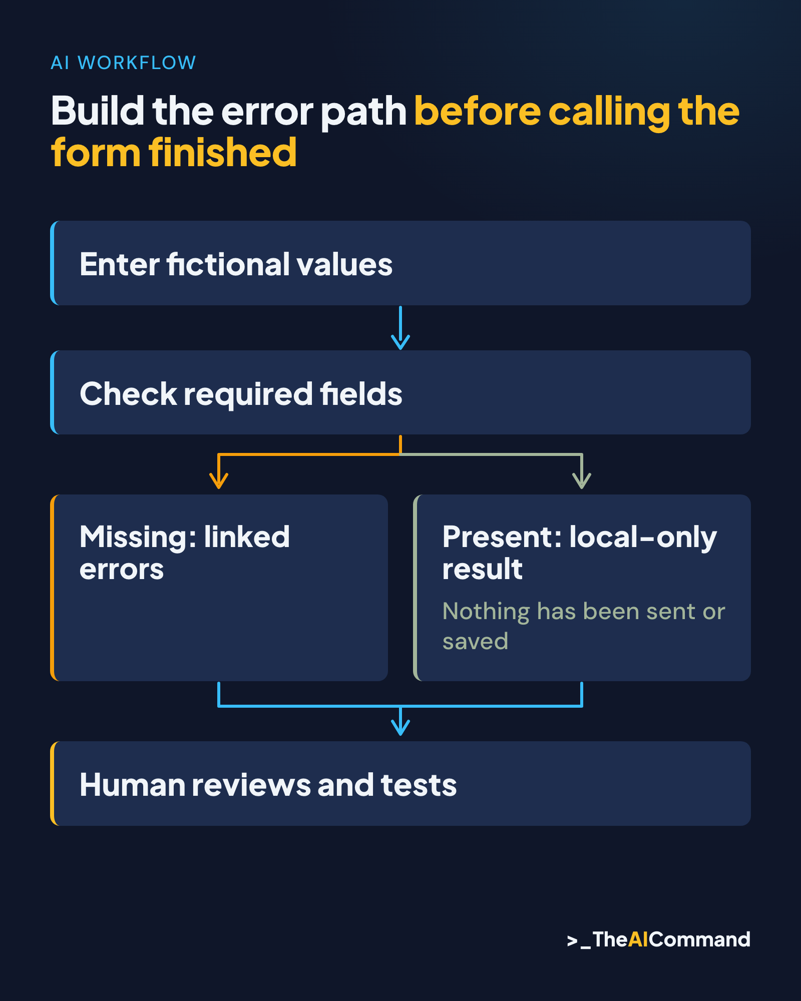
The corrected script intercepts the form's submission event and prevents navigation. It checks the three required values after trimming surrounding whitespace. When a value is missing, it sets an invalid state, displays a specific inline message and adds a summary link to the affected field. The optional delivery note is excluded from that requirement.
After an invalid check, focus moves to the error-summary region. Its links move focus to their respective controls when activated. The messages explain the correction needed, including Choose a request type and Enter an invented team role. This gives the person a route back into the task rather than a generic failure notice.
W3C's notification tutorial supports clear feedback and ways to identify and correct errors. The demonstration's summary is an implementation of that purpose. It still needs testing with relevant assistive technology, because code that appears appropriate does not establish the resulting announcement or user experience in every environment. Source: W3C notifications
The script preserves entries when another field fails. It clears the previous summary and rebuilds current errors on the next check. It also clears an earlier success message when the person edits a field. Errors are reassessed on check, rather than continuously during typing. State that behaviour so the reader can understand what the code is doing.
Keep the successful outcome truthful
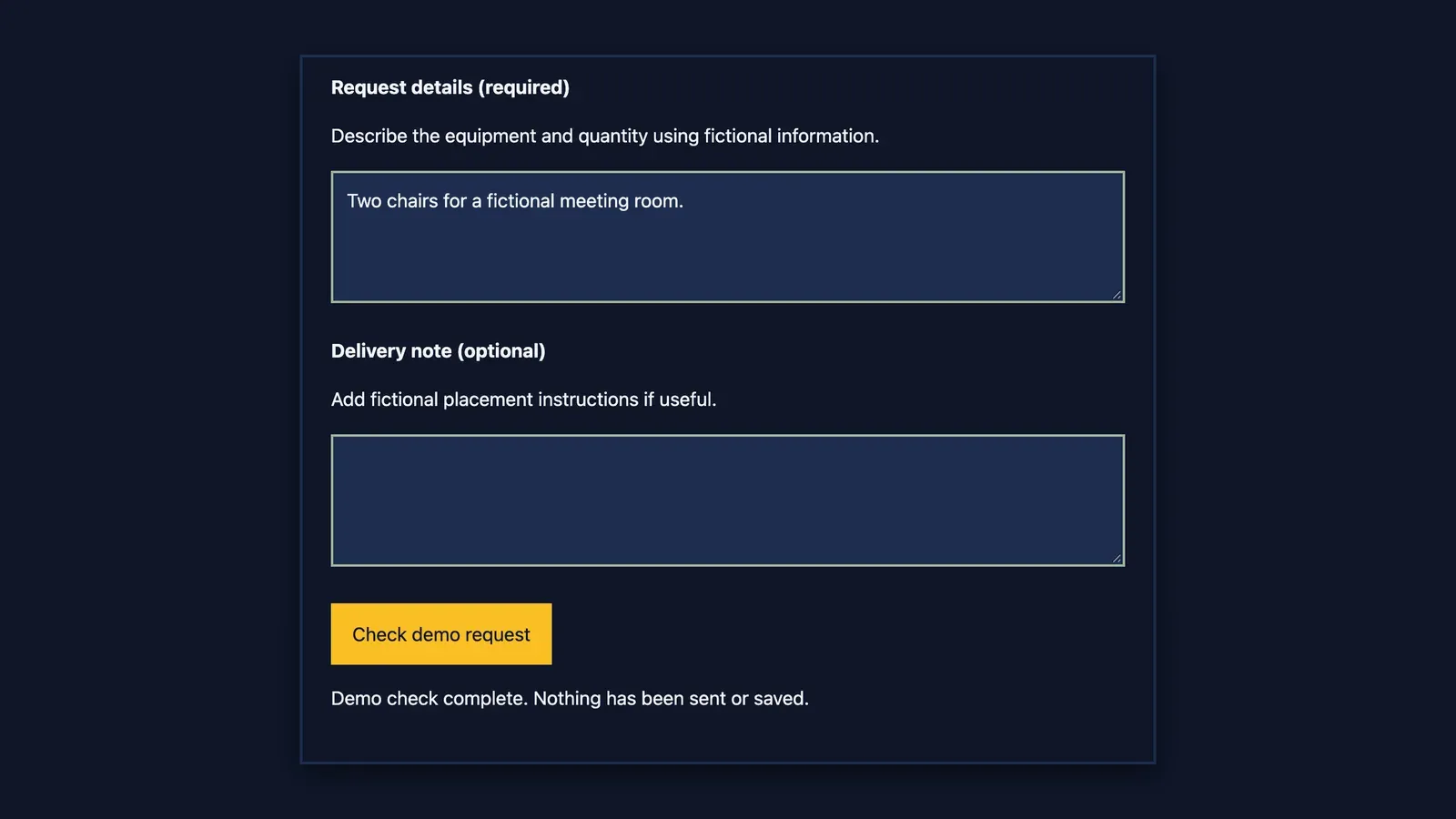
When the required fields are present, the demonstration hides its error summary, clears invalid states and displays a local-only result. It does not erase the entries. The message explains that nothing has been sent or saved. A person can inspect the values and repeat the exercise without believing that a service desk has received a request.
Do not use a success banner saying Request submitted unless a real submission has occurred and been confirmed. A local validation result and a server receipt are different events. If the form later connects to a service, the interface and tests must account for the actual processing and its failure modes.
The example contains no fetch call, submission endpoint or storage API. That source inspection supports the stated demonstration boundary. The local resource check also showed no external resources in the tested page. These observations concern the supplied file; they do not certify a future modified form or a hosting environment.
JavaScript-disabled behaviour also needs an explicit limit. The demonstration starts with disabled controls and enables them only after the local handlers are installed. A form-action policy blocks native submission as an additional boundary. With scripts unavailable, a notice explains why the controls remain disabled. This is not a complete progressive-enhancement design for a production service. If the intended service needs to work without scripts, that becomes an additional implementation and testing requirement.
Run a small set of observed checks
The local test opened the corrected file in an isolated Chrome context. Chrome reported version 156. An accessibility snapshot of the final version exposed four controls with the expected names and descriptions. This is evidence of the browser's exposed structure. It is not a screen-reader listening test or independent confirmation of the operating system.
Keyboard navigation reached request type, team role, request details, delivery note and the check button in sequence. The focused button had a solid computed outline. Activating it with empty fields moved focus to the error-summary region and produced three specific links. Each link, activated with the Enter key, moved focus to its field.
The valid-input check selected Chairs and entered Facilities coordinator with a fictional two-chair request. Delivery note remained empty. The error summary became hidden, invalid states were cleared and the local-only result appeared.
A later partial-input check replaced the role with whitespace while preserving the type and details. It produced the role error and retained the other entries. That confirms the supplied trim-based empty check and preservation behaviour in this browser. It does not establish that every possible invalid entry has been handled.
At a 320-pixel viewport, the document did not exceed the viewport width and the form displayed as a single column. This is a useful narrow-layout observation. Zoom, text resizing, other browsers, assistive technology and testing with users remain separate work. Keep those untested areas beside the results rather than implying a complete accessibility pass.
Inspect any generated code before reusing it
Check the field specification against the source. There should be four controls, three required fields and one optional note. Confirm that every label points to the intended control and every description reference resolves. The code should preserve the fictional-data instruction and avoid adding a real submission route.
Review the script's use of entered text. This demonstration writes only fixed messages, using textContent, and never inserts the person's entries into the page. It does not display a generated request body or store information. If another version introduces a preview, persistence or external connection, inspect those changes on their own merits.
Keep the initial and corrected versions distinct. Do not overwrite the defective example and then describe the revision as though its earlier behaviour had been observed. The issue log should identify which findings came from source inspection and which checks ran against the corrected implementation. That distinction makes the evidence understandable to the next reviewer.
Ask the assistant to explain changes in relation to the brief. A useful answer says which field, instruction or recovery behaviour changed and why. It should also identify checks it could not perform. Reject a generic claim that the form is fully accessible when the evidence covers only code structure or a limited browser run.
Make further testing part of the handover
Before operational use, test the actual delivery platform with the browsers and assistive technologies relevant to its users. Include empty, partial and successful paths, keyboard recovery and repeated edits. Test the task people need to complete, not only whether the page loads or an automated checker reports no issues.
Involve people with relevant access needs and the service owner. Their feedback may expose wording, process and support problems that a source inspection misses. The technical implementation and service process need to support each other. A label association cannot explain an unclear policy, and clearer policy wording cannot repair an unreachable control.
Retain the code version and test evidence together. The reusable Markdown includes the full source and the observed-check record so the demonstration can be repeated. Any change to fields or validation needs a fresh check of the affected paths. A copied component does not carry an automatic approval from its original context.
Start with the brief, map it to necessary fields and build the recovery path as carefully as the ordinary path. Use AI to draft and explain the implementation, then verify what the rendered form actually does. The practical outcome is a small, understandable demonstration with a clear record of what still needs testing.
Reusable materials
Form-build prompt and local demonstration
Constructed fictional internal equipment request. The initial and corrected source below are identical to NOV-05A so both articles refer to one demonstration. No submission or storage integration.
Brief-to-field specification
Build prompt
Manual check checklist
- Compare all four fields and their rules with the brief.
- Inspect label, description and error associations.
- Tab through controls; activate the check button and error links by keyboard.
- Check empty, partial/whitespace and valid input, including optional blank.
- Confirm valid entries survive another field's error and success wording stays truthful.
- Check narrow layout, then separately test zoom/text settings, relevant screen readers, other browsers and real user tasks.
Initial source, deliberately defective
This is constructed teaching code. Do not use it as a production form.
Corrected local demonstration
Save this code as a local HTML file to repeat the checks. It has no transmission or storage integration. Errors remain until the next check; changing a field clears any earlier success message. The controls start disabled and are enabled only after the local handlers are installed. A form-action policy also blocks native submission. When scripts are unavailable, a notice is displayed and the controls remain disabled.
Observed evidence and limits
Chrome reported version 156; the browser-reported OS string is not independent OS verification. Observed on the final version, using real key presses: an accessibility snapshot exposing every label and description, keyboard order (request type, team role, request details, delivery note, check button), empty-state errors with focus on the error summary, each summary link moving focus to its field, a valid result with the optional note blank, a whitespace role error with other entries kept, a single-column layout at 320 px with no horizontal overflow (305 px measured), and all five controls disabled with scripts disallowed.
Not tested: screen-reader announcements, other browsers/OSs, all zoom/text settings, users with access needs, real submission, server validation, real data handling or legal compliance.
Review correction and repeat checks
A final review found that the earlier local demonstration relied entirely on JavaScript to prevent native submission. The corrected source now starts with a disabled fieldset and enables it only after handlers are installed, with a form-action restriction as another boundary. Repeated keyboard, empty, valid and whitespace/partial checks passed in the final source. In a sandboxed frame with scripts disallowed, all five controls including the button remained disabled. This is a scoped no-script check, not a complete browser failure-mode test.
Related reading
References
- W3C Web Accessibility Initiative, Labeling Controls (Forms Tutorial), updated 13 May 2024: https://www.w3.org/WAI/tutorials/forms/labels/
- W3C Web Accessibility Initiative, Form Instructions (Forms Tutorial), updated 13 May 2024: https://www.w3.org/WAI/tutorials/forms/instructions/
- W3C Web Accessibility Initiative, User Notifications (Forms Tutorial), updated 3 June 2022: https://www.w3.org/WAI/tutorials/forms/notifications/
- MDN Web Docs, CSP: form-action (accessed 24 October 2026): https://developer.mozilla.org/en-US/docs/Web/HTTP/Reference/Headers/Content-Security-Policy/form-action
General information only. Not legal, compliance, financial, or professional advice.
TheAICommand. Intelligence, At Your Command.